More
ColorHub v2.0 has Landed 🚀
The day has finally arrived!
I'm proud to present you the second major release of ColorHub! This version comes with a whole load of brand new features that I hope will make it even easier for you to find that perfect palette, and your project up and running even more quickly.
Read on to see what's new with ColorHub version 2.0!
Next.js/Tailwind Starter kits
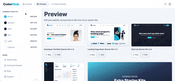
The most significant upgrade to ColorHub comes in the form of Starter Kits. These one-page templates make it easy for you to get your site live without any hassle.
Version one allowed users to preview their palettes on a range of simple wireframe layouts, but starter kits takes this a step (or two) further. Now, you can see how your palette looks in the wild, viewing it on a number of live landing pages.
If you like how your custom styles starter kit looks, simply download it as Next.js/Tailwind CSS project with your colors already plumbed in, and you're off to the races in just a few clicks.
30 New Palettes
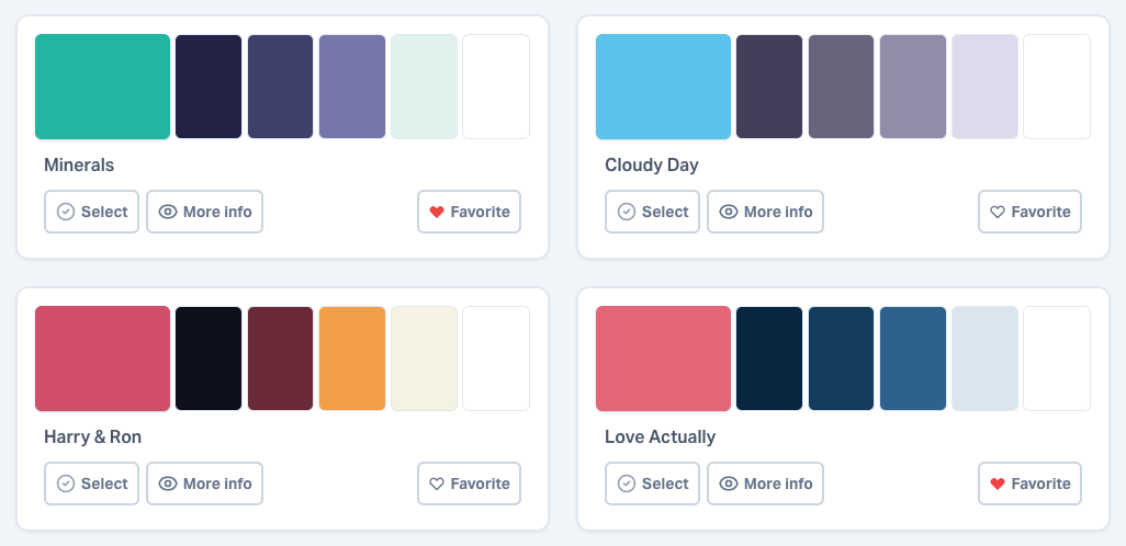
This release contains 30 brand new palettes, and enhancements to our existing library, taking the total of hand-curated palettes to 150.
I'll be taking it to 200 in the first quarter of 2023, so look out for new additions in the coming weeks.
Extended Palettes
Each of ColorHub's pre-made palettes has been expanded, to include two extra colors! Each palette contains six colors, giving our users more control over their sites' styling, and allowing for more variety.
Save your Favorites
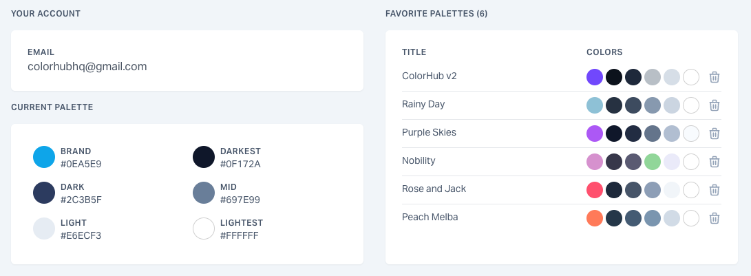
It's now possible for users to save their favorite palettes for easy access in future. When you're signed in, just give the heart a click and you can find all of our favorites in the manage account page.
Most Popular Palettes
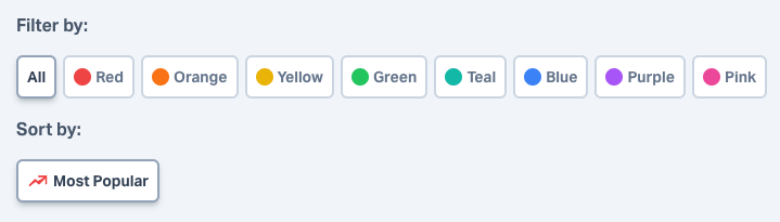
It just got even easier for you to find the perfect palette, as now you can sort palettes by most popular, prioritising palettes that have been favorited the most by ColorHub users.
Contrast Checker

So you've found the right palette, but you're not sure how to use it. Should you use the darkest color for a background, and the mid for text? Maybe the other way around? Use our simple contrast checker and make sure your color combinations will be accessible.
Thanks for reading!
Thanks for taking the time to read this article. To keep up to date with every development I make to ColorHub, please follow me on Twitter.